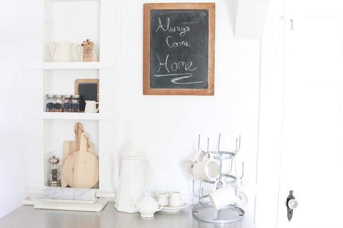
Modern Farmhouse Kitchen Reveal – Part 2
Today I’m sharing more of our modern farmhouse kitchen reveal! If you missed the first part of the tour, stop by this post. I’ve got lots of details and resources you can find there. This next tour focuses on our “coffee house style” island/cart…
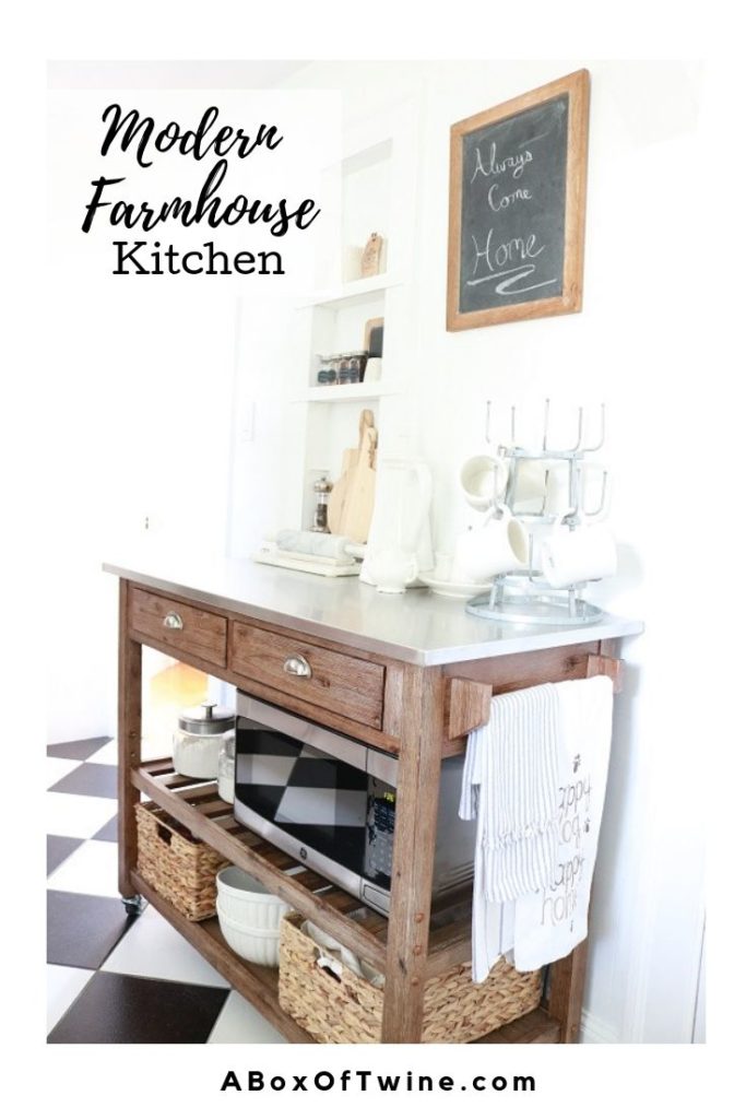
The short wall you see here is opposite the main cabinet/stove/sink wall, and it is between a doorway to our dining room and a door to the basement. There’s not much room, but it does have a cute original recessed built-in. Prior to our renovation, this is where the stand-alone stove stood.
Baking/Cafe Cart
We decided to create a “coffee house themed baking station” here. Is that a thing? Basically we purchased this island/cart on Wayfair and created a zone for baking and prepping coffee.
The mugs, cream/sugar bowls, and coffee maker (stored away for now) will reside on the top for easy access to coffee preparation.
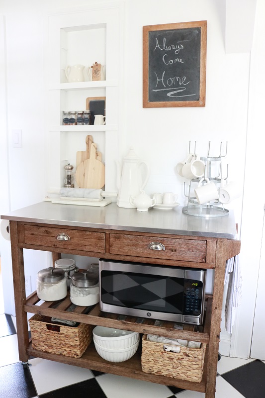
Those two drawers provide ample storage for baking and entertaining utensils, while the shelves below are big enough to house the microwave. I store baking supplies, pans and bowls in the baskets and display flour & sugar in the pretty canisters. The white mixing bowls on the bottom shelf are both lovely and functional. I also like that we can access linens and paper towels on side rods.
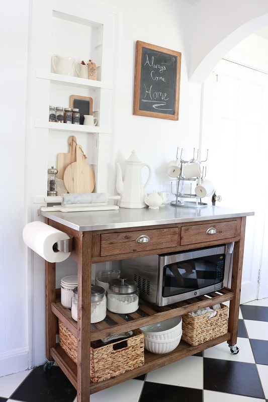
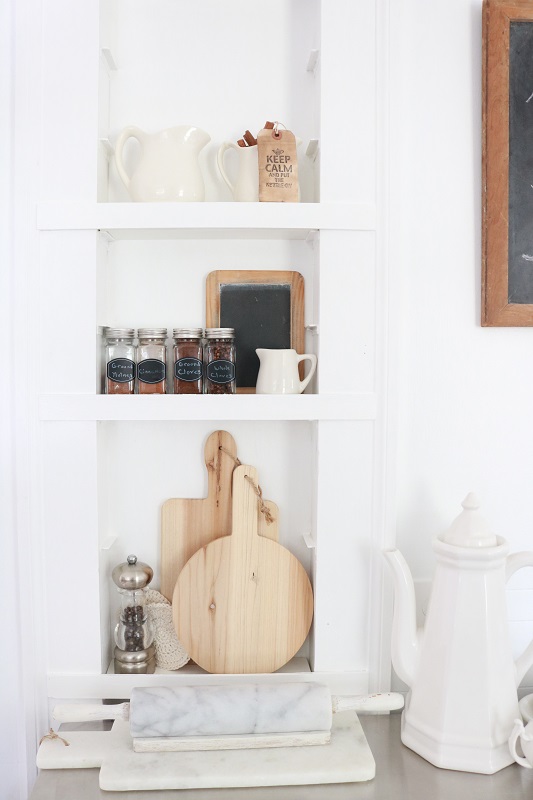
Built-In Spice Shelving
Our kitchen came with this recessed built-in, which we believe used to serve as a shallow ironing board closet. A previous owner had installed small shelf supports, so I’m using a few of the shelves to store baking spices and related accessories. Perfect use of the space!
Mudroom Back Entry
There is a back entry at the far end of our kitchen, which you can spy from this angle:
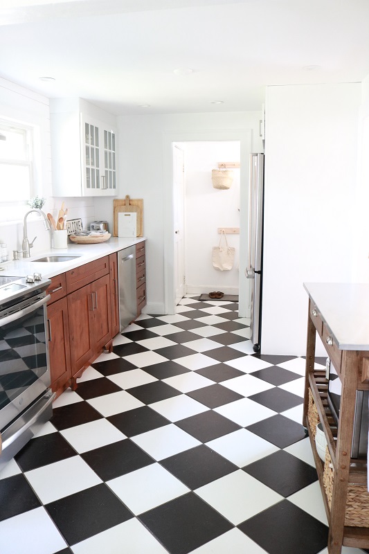
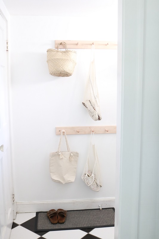
Since there’s not enough space to actually call it a ‘mud room’, we have to be practical with storage solutions here. Inspired by this post on kitchen storage solutions, I picked up some shaker peg racks at the Container Store & adorned them with cute baskets & bags.
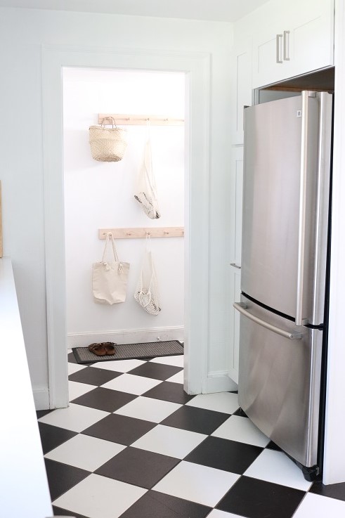
This view also allows a peek at our new cabinetry surrounding the refrigerator. The fridge used to stand all alone in this corner, and now we’ve got pantry storage! The cabinetry is from Kraftmaid, painted in White Dove.
As part of our kitchen renovation, we purged a lot of stuff and really focused on what was absolutely necessary in such a small space. This post helped me to declutter and create zones with purpose. Now this kitchen gives us much more freedom, as opposed to feeling weighed down by the old one. Yay!
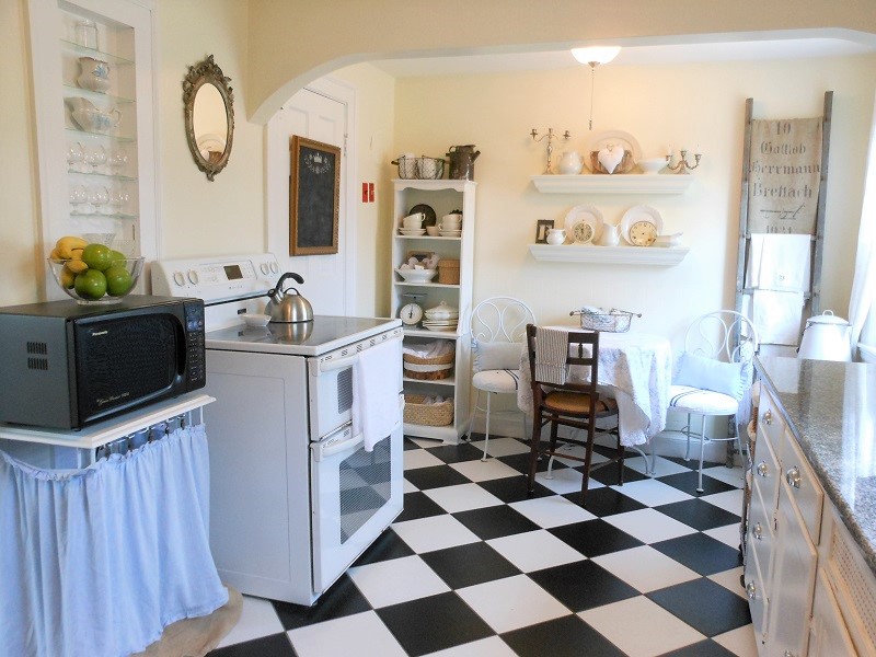
Just for kicks I thought I’d share an old view of the wall where the stove was, circa 2012. (Gosh, I guess decluttering was definitely necessary here! And I’m not sure what I was thinking with that microwave cart). There is now an arched doorway into our living room where that white shelving unit used to be:
I do hope you enjoyed today’s ‘Part 2’ of our modern farmhouse kitchen reveal. You can check out Part 1 here, and be sure to let me know what you think. What’s your favorite change?


2 Comments
Bernice Murray
Susan, I think the kitchen looks bigger and I especially like the microwave cart. Bernice
Susan
Thanks so much, Aunt Bernice! We’re loving the new kitchen and agree – it really does seem bigger.